

Having worked in the medical negligence industry where CPCs can be as high as £40 or £50, I’m very familiar with how valuable utilising competition graphs to find those lower volume cheaper – but equally as effective – CPCs can be. When we’re talking CPCs as high as the ones I’ve just mentioned it’s easy to burn through budget, even with a great Conversion Rate, so finding those gems within the lower volumes becomes even more critical, especially when it comes to building out campaigns or trying to find more areas to cover.
It’s not just PPC where competition graphs can be a valuable addition & today I want to look at how we can utilise these very popular Excel graphs within SEO strategy, to understand where the opportunities lie to drive growth/visibility across both SEO & Digital PR.
Fortunately, there are a number of different ways that you can work with Excel & data from some of our favourite digital marketing tools to really understand what’s available in the market & where the opportunities might lie.
Let’s take an example…
A few months back I was drafted in to pull together a proposal for a promotional products company. This company specialised in a wide range of different promotional products, & one of the tasks I undertook as part of the proposal process was to identify key areas of opportunity so we could see where the value lay for our clients. This would form the foundation of not only our SEO strategy but also guide our Digital PR strategy when it came to link acquisition & where we wanted to focus our efforts.
I reference the Excel spreadsheet below – pulled together with data just from AHRefs & plotted on a three axis graph, by overlaying CPC data with Search Volume & Difficulty.
Now this graph can be utilised for both SEO & PPC – for SEO it’s even more useful as you can use AHRefs “competition metric,” which for those of you who aren’t familiar with it, judges how hard it is to rank for a particular keyword given the number of higher Domain Rank websites that currently rank above that term. Essentially, it gives an overview of the volumes of specific keywords mapped against keyword difficulty to give you an idea of how achievable it might be to rank for that given keyword.
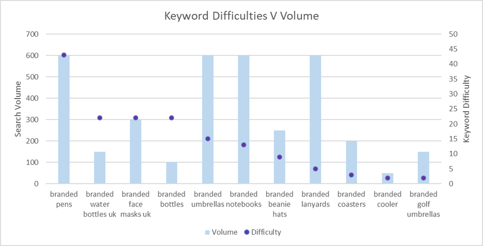
From the data above we can quite clearly see a number of significant trends. Initially, we can see that the market place has high search volume for branded pens, but also that this has super high competition & trying to rank on this term might be quite difficult. By contrast, if we look at other branded products such as lanyards, umbrellas or notebooks we can see a similar search volume level but a much lower level of keyword difficulty – an area of opportunity.
From utilising a simple graph above (and there’s many more products that we can populate in there) we are able to draw deductions around how to create an effective SEO/Digital PR strategy to maximise opportunity for the client, while still keeping in mind commercial intent & ensuring we are also applying adequate focus to commercially important terms.
Now we’ve seen this work for branded promotional products, how does it work for higher CPC terms like “medical negligence?”
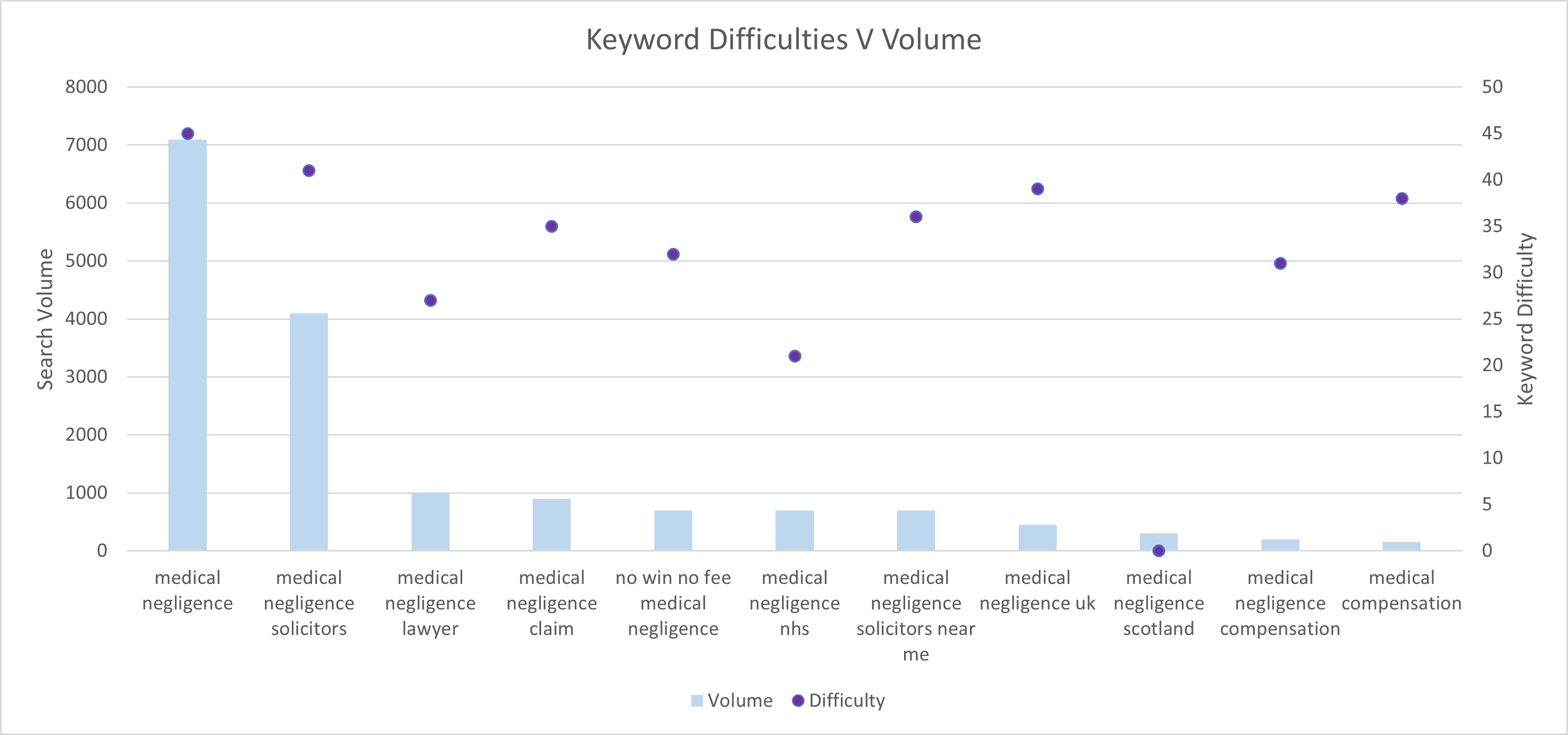
In this example we can see a far more pronounced difference for the high volume terms – but again we have some great areas of opportunity. We can see from this data that the popular “medical compensation” term is, in fact, low search volume for very high competition, compared to something we perhaps wouldn’t target, such as “medical negligence nhs” or even “medical negligence lawyer” which despite still having reasonable keyword difficulty has a much more established search volume (or reward!) to match.
All in all the graphs above are very simple to produce & incredibly easy to pull together utilising the following steps:
- Login to your AHREfs account
- Navigate to the “Keywords Explorer” tab & input your list of targeted keywords
- Download the Spreadsheet
- Remove all columns except “Keyword” “KD” & “Search Volume” & pull these into Excel using a multi-touchpoint graph
And there you go… a quick & easy way to pull together an effective graph which allows you to easily identify areas of opportunity, quick wins or perhaps more long-term gains for your clients which ties in with real-word metrics (search volume) to see achievable gains.